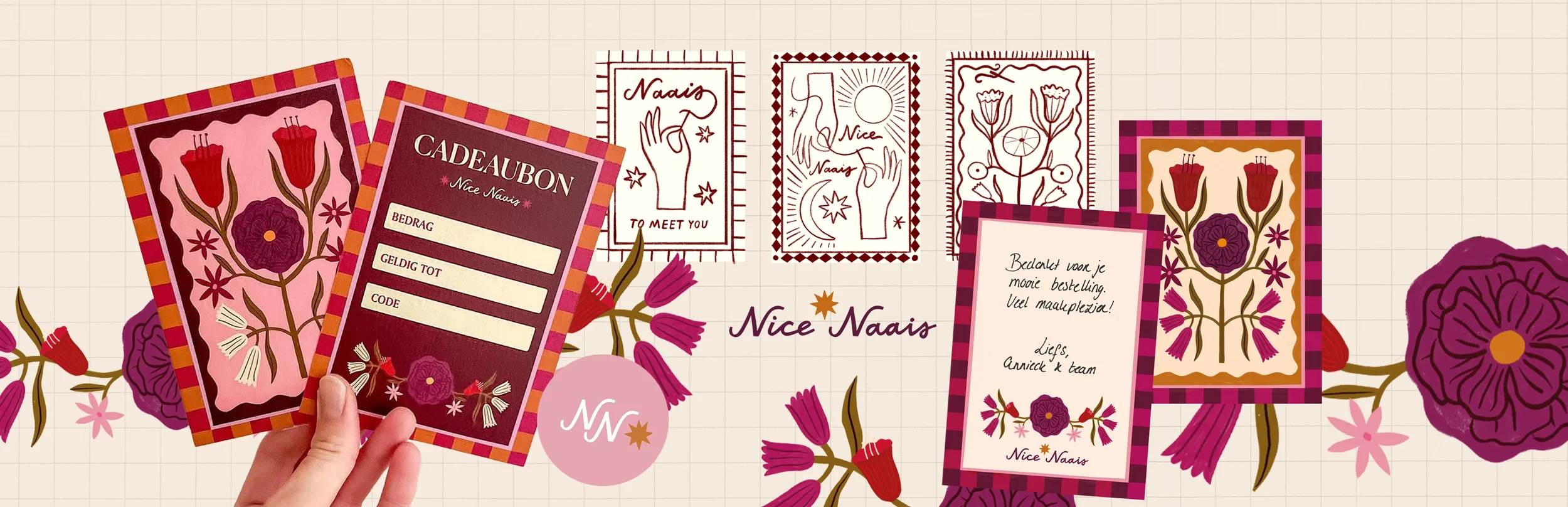
a visual identity sewn to fit
For this project, the client asked me to refresh the brand identity with a new logo, a gift card, and a thank you card, all centered around a custom illustration and updated color palette. Annieck wanted the illustration to reference sewing, while giving me creative freedom to explore directions that would feel authentic and playful.
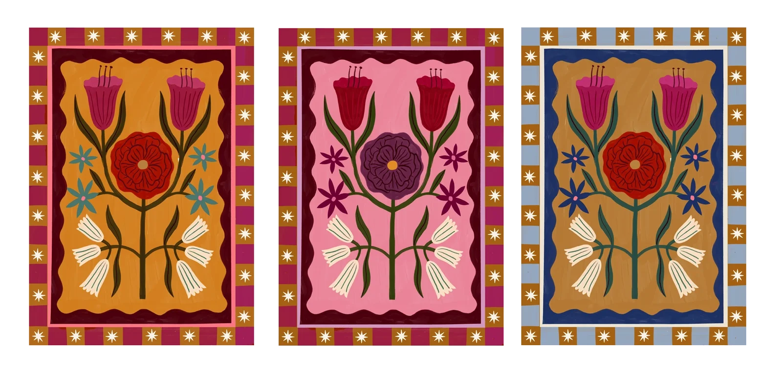
sketch and color proposals
I started with the illustration, the centerpiece of the project, using warm tones inspired by the fabrics in her webshop. After testing several sketches and color options, the third concept became the final direction, balancing playfulness and personality.
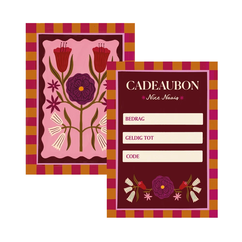
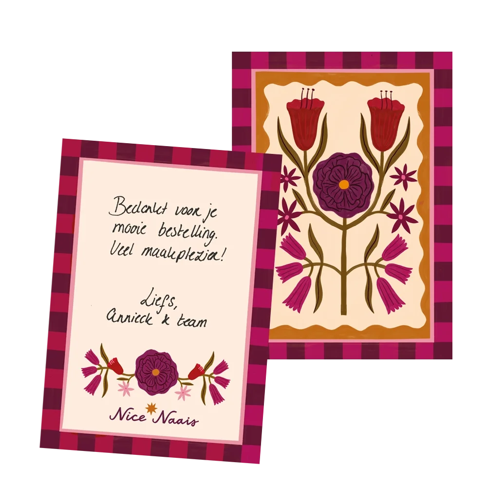
gift card and thank you card
The gift card and thank you card were designed to complement each other, sharing the same core illustration and overall style, but each features a distinct colorway to give them their own character. To make the thank you card even more personal and meaningful, we included a handwritten note from Annieck on the back, turning it into a small, heartfelt message for the recipient. This simple touch transforms the card from a standard giveaway into a unique keepsake, reflecting the warmth and personality of the Nice Naais brand.
logo redesign
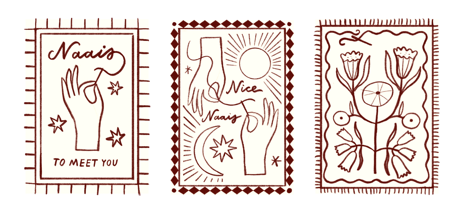
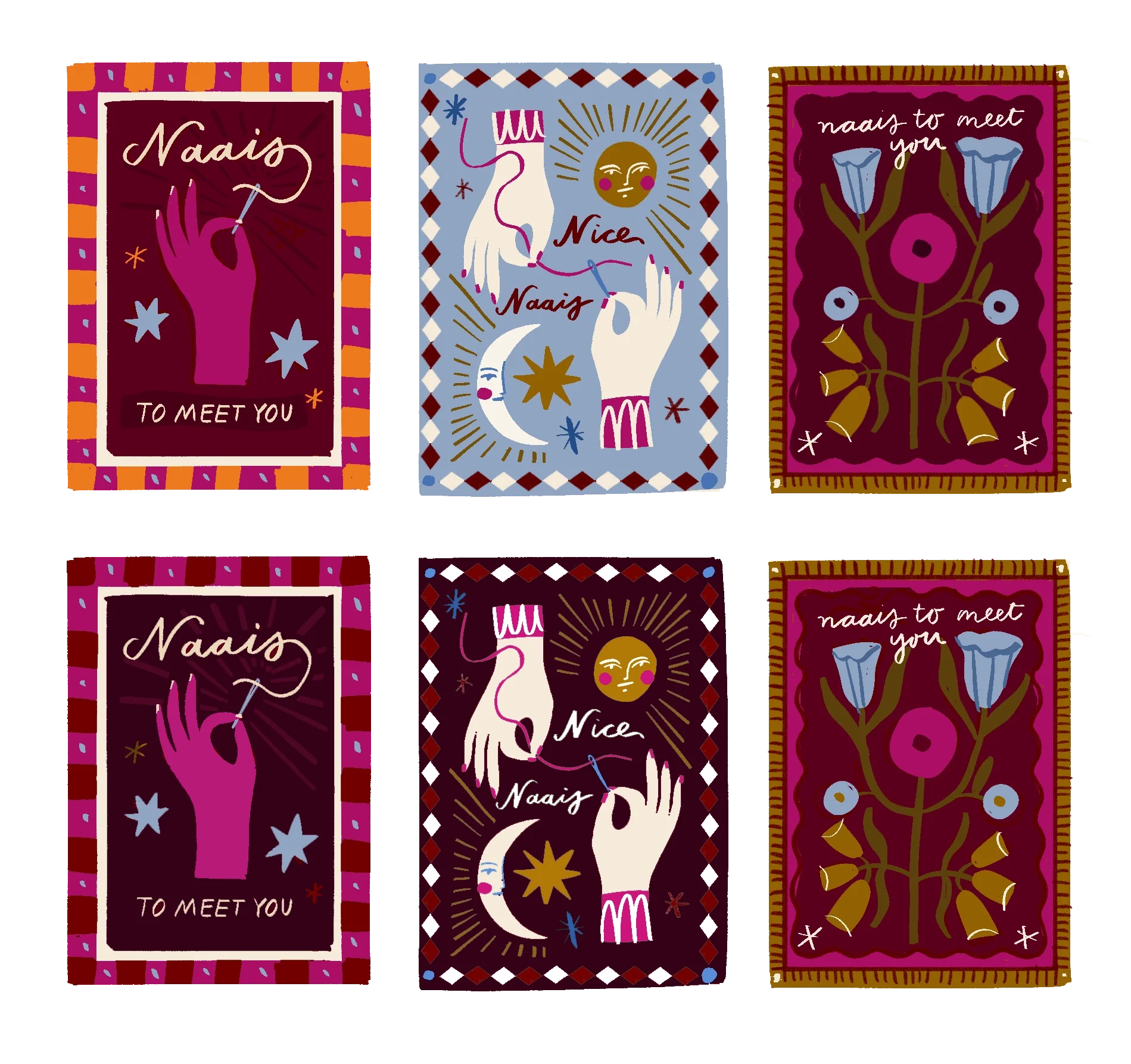
For the logo, I started with the temporary design used on the gift card, as it already had a strong, recognizable character. From there, I explored several directions: the top versions stayed closer to the old logo, with sunray dots subtly referencing sewing pins in a needle pad; a playful, refined detail that gives the logo a unique charm. The middle options leaned more directly into sewing, incorporating delicate needle and thread motifs, while the bottom two explored a star detail, each with its own variation.
In the end, we chose the star logo. Its simplicity, memorability, and friendly, approachable style perfectly captured the essence of Nice Naais while complementing the broader visual identity.